10 min read
Product photography for ecommerce: a small shop setup
Product photography for ecommerce on a small budget: one soft light, a plain background, a fixed shot list, and what Amazon and Shopify ask for.
By Jorge Rodríguez
On this page
Good product photography for ecommerce comes from a setup you can repeat: one large soft light, a plain background, a camera on a tripod at the product's middle height, and the same shot list for every item. You do not need studio flashes. A window, a white foam board and a phone cover most small shops.
What equipment do you need for ecommerce product photography?
A tripod matters more than the camera. It keeps every product at the same height and angle, so your category pages line up, and it lets you shoot in window light at slow shutter speeds without blur.
A current phone is enough for listing photos. Use the 2x or 3x lens and step back. The wide 1x lens, used close, stretches whatever is nearest to it, so the front legs of a side table look longer than the back ones.
The rest of the kit is cheap:
- A tripod with a phone clamp, and a Bluetooth remote or the self-timer.
- A large white foam board, to bounce light into the shadow side.
- A plain backdrop: a white wall, a paper roll for small items, a clean painted floor for furniture.
- A sheet of plain white printer paper, to set the white balance of each series.
- Masking tape, to mark where the tripod and the product stand so every shot matches.
Which camera settings should you use on a phone?
A phone decides exposure, focus and colour for every frame on its own, and it decides differently each time. Take those decisions away from it before the first shot, in this order:
- Switch to Photo mode, not Portrait. Portrait's fake background blur chews into thin edges like chair legs and lamp stems.
- Turn on the grid, and line up the table edge or the floor line with a horizontal grid line.
- Lock exposure and focus. On an iPhone, press and hold on the product until AE/AF Lock appears.
- Swipe the exposure down a little if a cream lampshade or a white sofa loses its texture. Detail lost in a blown highlight never comes back.
- Fire with the timer or the remote, so pressing the shutter does not shake the phone.
- Shoot at full resolution and keep the originals. You can always export smaller, never larger.
The lock is the setting that saves the most time later. Without it, a series of eight shots of one oak bench comes out at eight brightnesses, and you spend the afternoon matching them by hand.
Product photography lighting: how do you set it up?
Use one big, soft source. A window with no direct sun on it, on a bright overcast day, is the cheapest softbox you will find.
Put the window at about 45 degrees to the front of the product and the white board on the opposite side. Then switch off the ceiling lights. Mixing warm bulbs with daylight gives you a white sofa that is blue on one side and yellow on the other.
Move the board, not the product, to control the shadow. Closer to the product, the shadow side opens up and the piece looks flatter. Further away, the shadow deepens and the shape reads more.
Daylight changes through the day, so shoot one product's whole series in one go. For colour, put the sheet of white paper in the first frame of each series. In editing, set the white balance on that paper and copy the same correction to every frame of the series.
Product photography background: white or not?
Use plain white or light grey for the main image. It keeps a catalogue consistent, and Amazon asks for a pure white background on the main image.
A phone will not give you pure white straight from the camera without overexposing the product. Expose for the product instead, then lift only the background in editing with a mask or a background tool.
Check the result with an eyedropper: the background should read 255, 255, 255. Then zoom along the edges at full size, because a careless cut-out leaves a grey or white halo that shows on any coloured page.
Save textured or styled backgrounds for the context shots further down the gallery. A linen sofa against a busy wallpaper reads as a room, not a product.
Which angles does every product need?
Keep one order for every product. Buyers learn where to look, and you stop forgetting the back.
- Main image: the whole product on a plain background, usually at a three-quarter angle.
- Straight front.
- Side profile, which shows depth.
- Back, especially for furniture that might stand away from a wall.
- Details: the material, joints, handles, a label or maker's mark.
- Context: the piece in a room, or next to an object everyone recognises.
The three-quarter main image does the most work. It shows the front and one side at once, so the shopper reads the shape from a thumbnail.
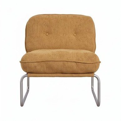
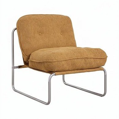
For a three-quarter view, turn the product, not the camera. Rotate it about 30 to 45 degrees from the lens, so one side is clearly visible but the front still leads.
What do Amazon and Shopify ask for?
The two platforms most small shops sell on publish their rules, and they point in the same direction. This is what each one says, from its own help pages.
| Rule | Amazon | Shopify |
|---|---|---|
| Main image background | Pure white, RGB 255, 255, 255, as a best practice | No rule; a consistent background is the advice |
| How much of the frame | The product fills 85% or more | Not stated |
| Size | Larger than 1,000 pixels on each side, so shoppers can zoom | 2048 x 2048 usually displays best for square images; up to 5000 x 5000 or 25 megapixels |
| File | JPEG preferred; TIFF, PNG and GIF accepted | PNG then JPEG recommended; under 20 MB |
| Consistency | Not stated | One aspect ratio for all main images, so collection grids line up |
Sources: Amazon's seller guide to product photos and Shopify's product media types. Both change, so check the pages before a big shoot.
One export works for both. We would export each main image as a square JPEG, 2048 pixels on each side, in sRGB, which CSS treats as the default colour space. That clears Amazon's zoom size, matches Shopify's recommendation and stays far under both file limits.
Name the files by product and position, such as oak-bench-01-main.jpg and oak-bench-02-front.jpg. The order then survives any upload screen, and a missing back shot is obvious in the folder.
Furniture photography: what changes?
A sofa does not fit on a paper roll. Shoot it against a plain wall with clear floor in front, and leave space on every side so you can crop to any ratio later.
Put the camera at roughly the middle height of the piece, around seat height for a chair. Shooting down from standing height makes a sideboard look short and squat.
Long pieces push you back. Step away until the whole sideboard fits with margin at 2x, rather than switching to 1x to fit it in, and the far end will not shrink.
On used or vintage furniture, photograph every flaw close up and in good light. A clear photo of a scratch now saves an argument after delivery. How to sell vintage furniture online covers the rest of the listing.
How do you know your photos are working?
Judge them where shoppers meet them, not on your laptop. Open your own collection page on a phone: at grid size, every product should still read as what it is, and every main image should sit at the same height.
Then count questions. Every message that asks "what does the back look like" or "is it really that colour" points at a missing or misleading photo, and the fix is a new frame in the gallery, not a longer reply.
Returns tell you the rest. If your platform records return reasons, watch for "not as described" or "colour different" on one product: a cluster there usually means its photos promised something the box did not deliver.
To test a reshoot, change only the photos. Leave the price, the title and the text alone for four weeks, then compare that product's views and add-to-cart rate with the four weeks before.
Can the same photos become a 3D model?
Yes, if they follow the same rules. A sharp three-quarter main image on a plain background is close to what image-to-3D tools need. The steps are in how to turn a photo into a 3D model, and every other route is in how to make a 3D model.
The 2048-pixel export above is plenty. easyrender rejects photos under 400 pixels on the shortest side and warns below 800, so the risk is a supplier thumbnail, not your own camera.
A 360 spin is a different thing: a set of photos taken on a turntable, which the shopper scrubs through. A 3D model is one file the shopper can turn freely and, on a phone, place in the room. 360 product photography or a 3D model sets out how each is made, what it costs and when to pick one.
easyrender builds a model from one of those photos and shows a free preview of every angle first. It works on single pieces like a floor lamp or an armchair, so give it the piece alone rather than a styled room. Upload a photo
What are the common mistakes?
Most of them come from the phone deciding something on its own, or from two light sources in one room. This is the list we check a series against, from symptom to fix.
| Symptom | Cause | Fix |
|---|---|---|
| A white sofa is blue on one side and yellow on the other | Window light mixed with warm ceiling bulbs | Switch the room lights off and shoot in daylight only |
| The front legs look longer than the back ones | The 1x lens used close | Step back and use the 2x or 3x lens |
| The white background looks grey | Exposure was set for the product, and the background was left as it came | Lift the background in editing until the eyedropper reads 255, 255, 255 |
| Chair legs have blurred, chewed edges | Portrait mode's fake depth blur | Shoot in Photo mode |
| Each photo of the series is a different brightness | Auto exposure measured every frame again | Lock exposure and focus before the first shot |
| Bottle-green velvet came out a different green | A filter or a heavy colour edit | Edit for accuracy, holding the real fabric next to the screen |
| The product looks small in search results | It fills much less than 85% of the frame | Crop the main image tighter |
| The collection grid looks ragged | Main images in mixed aspect ratios | Use one ratio, such as square, for every main image |
| Your own reflection shows in a lacquered cabinet | A glossy surface square on to the camera | Turn the piece a few degrees, or stand in shadow |
FAQ
Yes, a recent phone on a tripod, in soft window light, produces listing photos that are good enough for most marketplaces and stores. Use the 2x or 3x lens to avoid distortion, lock exposure and focus, and shoot every product from the same marked spot. The light and the background matter more than the camera.
Plain white or light grey for the main image, because Amazon asks for pure white and it keeps a catalogue consistent. For furniture, a plain painted wall and a clean floor work better than a paper roll. Keep textured or styled backgrounds for the context shots further down the gallery, where the room is the point.
A square 2048 by 2048 pixel JPEG in sRGB suits most shops: Shopify says that size usually displays best for square images and accepts up to 5000 by 5000. Amazon prefers more than 1,000 pixels on each side so shoppers can zoom. Keep the full-size originals and export from them for each platform.
Six to eight covers most products: a main image, front, side, back, two or three details and one in context. Furniture benefits from the full set because buyers cannot touch it before they order. A simple item like a pillar candle may only need three or four, as long as the main image is strong.
Lightly. Straighten the horizon, crop to your standard ratio, correct the white balance and clean dust off the backdrop, but leave the product's colour and its flaws alone. The photo is a promise about what arrives, and an edit that buyers notice on delivery costs more than it ever gained you.